 Make Custom Package
According to a recent study, blogs are the third most reliable source of information and are the most crucial part of internet marketing.
Bloggers are now the most trusted among many and people trust them and follow them religiously.
But, first and foremost, how can you encourage visitors to fall in love with your blog? Apart from the outstanding content that you post.
Blogging is a form of storytelling. A well-designed blog becomes an extension of the stories you tell.
The ability of a Blog Design to tell a story should never conceal or obstruct the reader’s ability to read the blog. An excellent blog design tells a story while also being traditional and comfortable to read.
How would you persuade people to read your material if you don’t captivate them visually?
After you’ve finished writing high-quality content, the next step is to present it in a way that clearly communicates what your blog is about.
If images, text, and links aren’t displayed in a way that’s appealing, easy to follow, and produces interest, visitors may abandon your content.
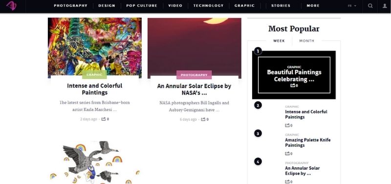
Help Scout
The best blog designs aren’t always the most complicated.
Help Scout, a company that makes customer assistance software, has a creative but simple style for its blog that we like since it employs less language and more negative space.
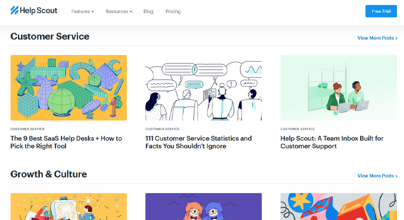
This blog’s usage of featured photos for all entries, including a banner one at the top that spotlights a recent or exceptionally popular entry, is one of the best features of Help Scout.
These icons are placed in front of bold, block colors to draw the reader’s attention and indicate the topic of the content. And it works because the design of this blog screams “clean” and “readable.”
Microsoft Stories
To be clear, we’ve already gushed about Microsoft’s “Stories” microsite.
what better way to breathe new life into an existing brand than with a blog full of gorgeous, engaging, and motivating branded content?
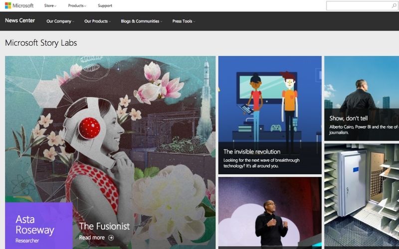
Furthermore, the square layout of these articles resembles the Microsoft logo, providing crucial brand consistency.
Microsoft Stories is also an excellent illustration of how a company blog can be a valuable asset in a rebranding effort.
Microsoft has sought to humanize its brand in recent years, largely in response to a rivalry with Apple. The tagline for the “Stories” microsite is basic.
When you’re trying to communicate a specific brand message, your blog may help – both visually and in terms of content.
Pando
A consistent color scheme and style is a vital part of a well-designed blog – after all, 80 percent of consumers feel that color helps them recognize a company.
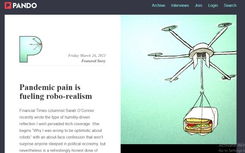
It’s fascinating to observe how color constancy can bring disparate design elements together.
Pando, a startup-focused blog, uses bluetones in numerous areas of the site, including the background, highlight bars, and select text spaces.
However, it also employs a variety of fonts, all of which, when combined with a unified color scheme, appear to be one.
Design Milk
To highlight its posts, Design Milk, an online modern design source, uses a relatively minimal interface.
The right-hand sidebar, which remains visible when you open a blog post to read it, is ideal for presenting thumbnail photos for new posts.
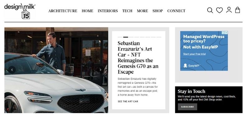
This is an example of an internal link strategy, which encourages readers to stay on the site longer.
The social icons at the top of the page are a nice addition to the site’s overall aesthetic – they’re easy to notice and make it simple to share Design Milk’s content.
Fubiz
Fubiz, a blog about art and design, is an example of a really clean design with some nice customization.
Side-scrolling through “highlighted” posts is available near the top of the blog’s site.
Below that is the Creativity Finder, which allows visitors to choose from a variety of identities ranging from “Art Lover” to “Freelancer,” as well as their location and the type of content they want to see.
Readers can then browse information that is tailored precisely for them.
Fubiz is able to visually draw people to its material by incorporating it into a design scheme.
Webdesigner Depot
It’s no surprise that this design news site is visually appealing with a name like “Webdesigner Depot.”
The way Webdesigner Depot has added social sharing icons on each post is something that truly should be admired.
While it is always recommended that visitors read each post, having those links readily available allows them to share a headline they find fascinating.
Check out those right-hand navigation arrows — scrolling to the top or bottom of a page has never been so simple.
Furthermore, the color palette, background, and fonts are all constant, giving this blog a professional appearance while remaining distinct from the standard blog templates that you may be used to seeing.
Mashable
On the homepage, Mashable divides its material into three distinct sections: new posts are presented on the left as thumbnails in the smallest size.
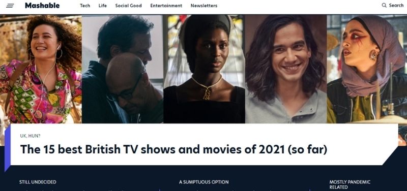
The “What’s Rising” posts are presented as large thumbnails in the center column, while the “What’s Hot” posts are featured to the right as huge thumbnails.
This three-pronged strategy to content display can assist readers in determining which type of news is most important to them — the top story or other postings that are currently trending.
Brit.co
The Brit + Co webpage screams “clean,” and “welcoming.” It’s clutter-free, which makes the content easier to consume, and the layout is exceptionally well-organized.
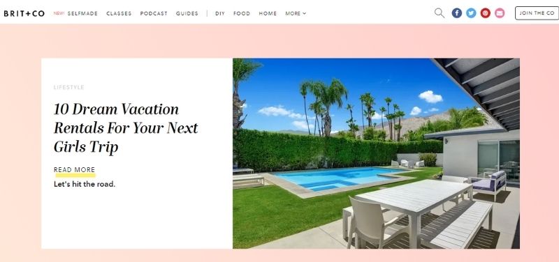
The understated “trending” header is also a smart approach to advertise popular content without being overly pushy.
Plus, with such fantastic pictures, we noticed the Pinterest nod – a vital sign to include when your site includes attractive imagery.
Pixelgrade
Pixelgrade is a design agency that specializes in creating beautiful WordPress themes for all types of creatives and small companies.
Their blog page does a fantastic job of showcasing one of their most recent or popular blog entries, complete with a clear call to action and a brief selection.
What should be appreciate best about the page is that the design is completely consistent with their brand and how they connect on other platforms like Instagram, Facebook, and Twitter.
You’ll have no trouble recognizing their blog pieces, as well as other content, while reading through social media.
TED Blog
The TED Blog has a polished look and feel that is ideal for news blogs and webpages.
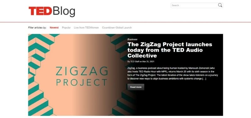
The top-of-the-page full-width header graphic promotes the most recent article. A call-to-action button appears beneath the blog title and description to urge visitors to read the post.
Visitors can navigate through all of the blog’s most recent articles beneath that section:
Visitors can also sort the articles on the site by newest, most popular, or other TED categories.
The Sartorialist
The Sartorialist is a fashion and photography blog that is also very popular. The blog design, as you can see, is mostly focused on exhibiting the photographer’s stunning work.
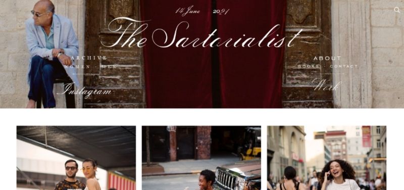
Infinite scrolling is utilized to improve the user experience rather than needing to click a typical “Next Page” button to see more photos.
The links in the website header can also be used to navigate the blog. There are links to:
- Archives of photographs
- About this page
- Page of Contact
- And there’s more on Instagram.
Copyblogger
The Copyblogger blog has a clean, minimalist style with plenty of white space.
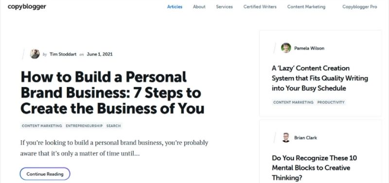
This blog design demonstrates that you don’t need a lot of things to make a page effective or intriguing.
Instead, you can allow your fantastic content do the talking.
The thumbnails of the most recent articles are displayed on this page. Visitors can read the entire post by just clicking on the thumbnail.
Writing Revolt
Writing Revolt is a blog dedicated to assisting aspiring freelance writers in building their portfolios, mastering SEO, and landing clients.
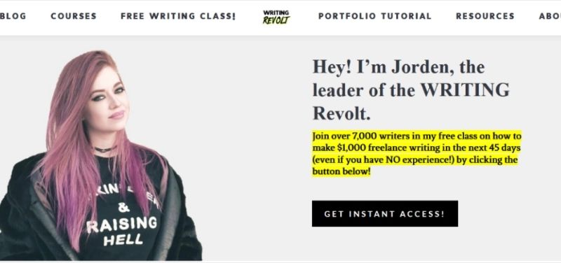
A photo of the blog’s owner, Jorden, introduces herself and her free freelance writing course at the top of the page. Visitors can exchange their email address for access to the course, which helps Jorden build her email list and sell paid courses afterwards.
There’s also a part with student feedback:
Displaying testimonials is an effective technique to persuade people to join your email list or purchase the product or service you’re selling.

Omer Nadeem
Co-Founder of artimization who is passionate about bringing colour, clarity and budget-ability to businesses' experience of IT.


No Comments